Key elements of Gdańsk’s vision
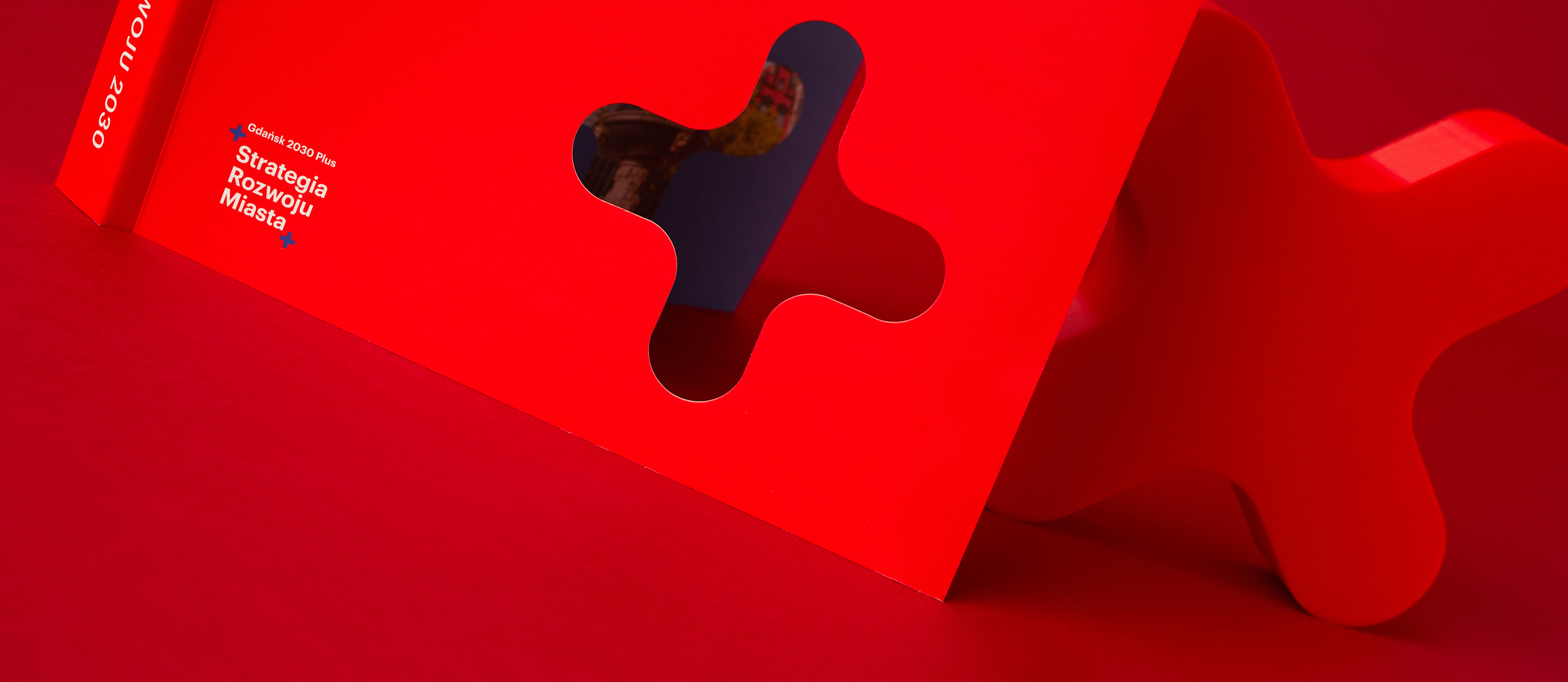
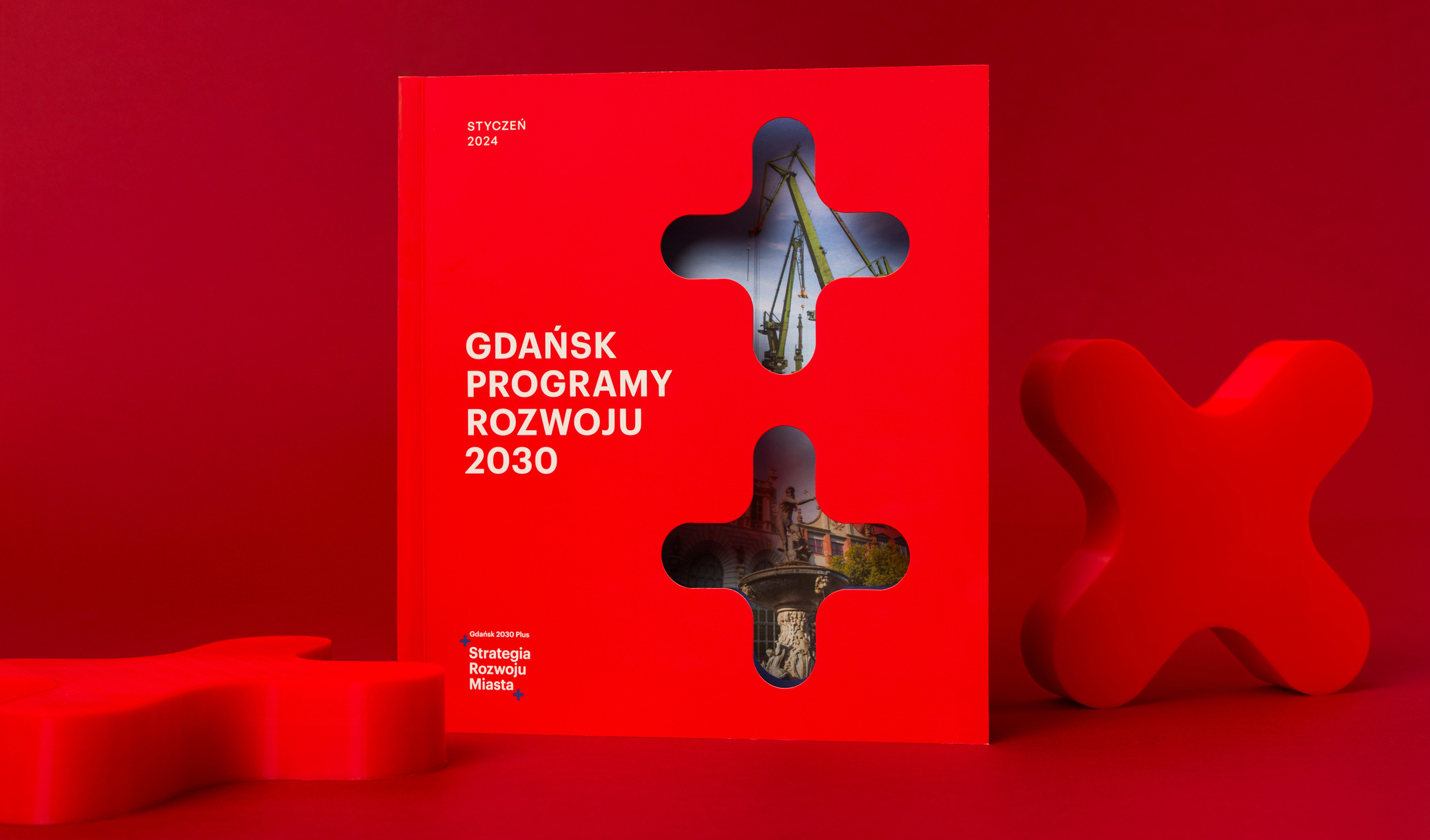
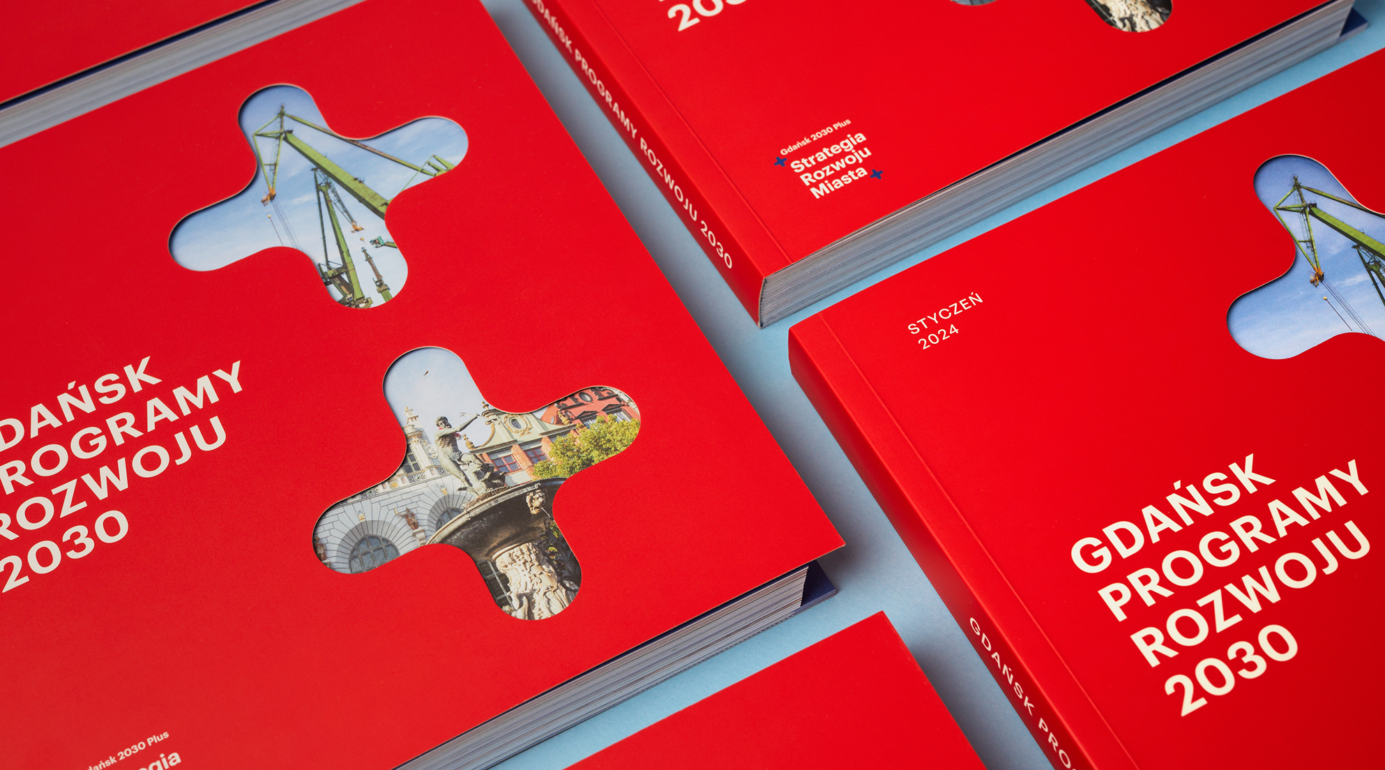
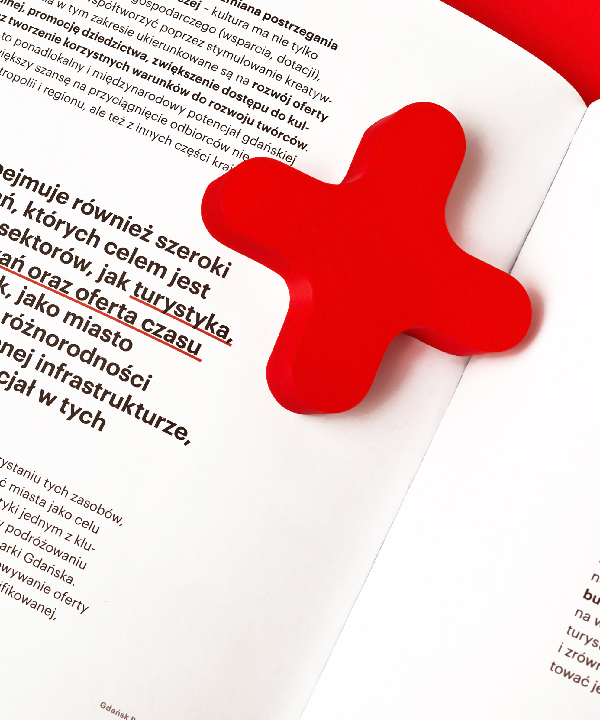
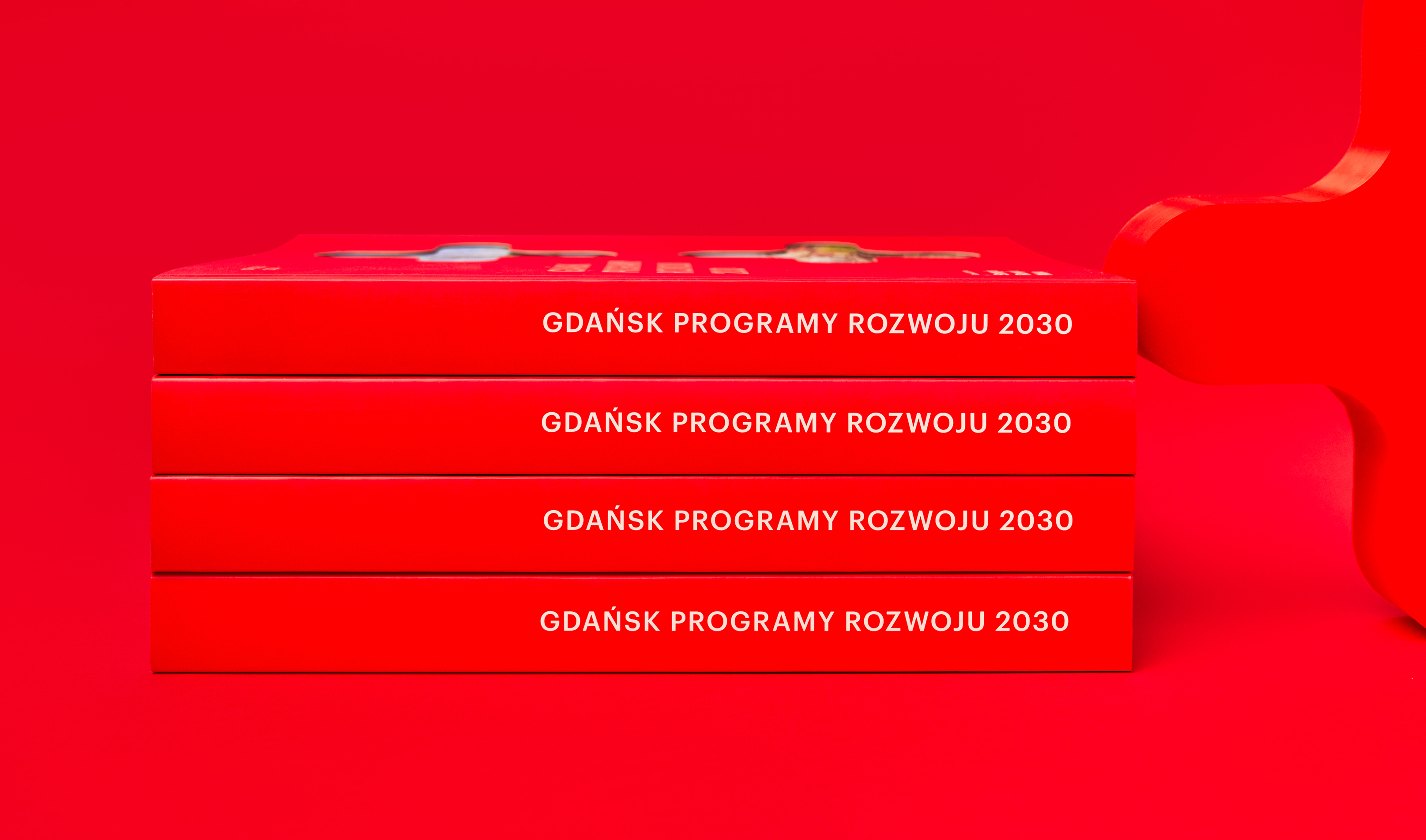
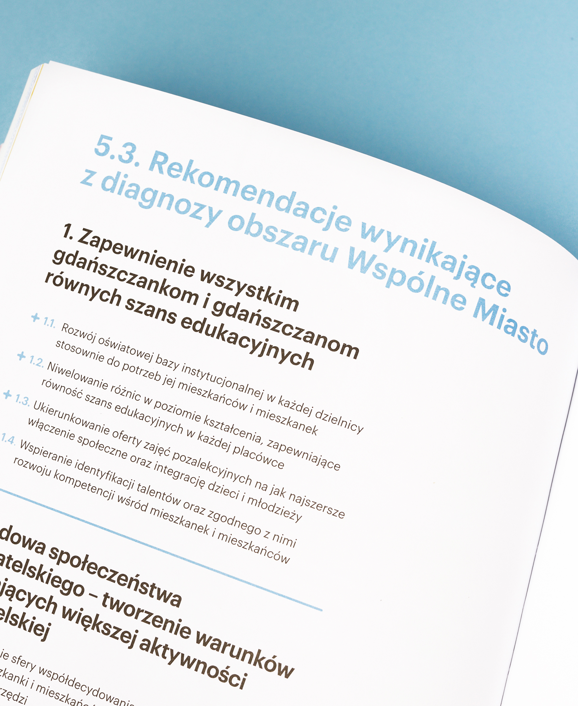
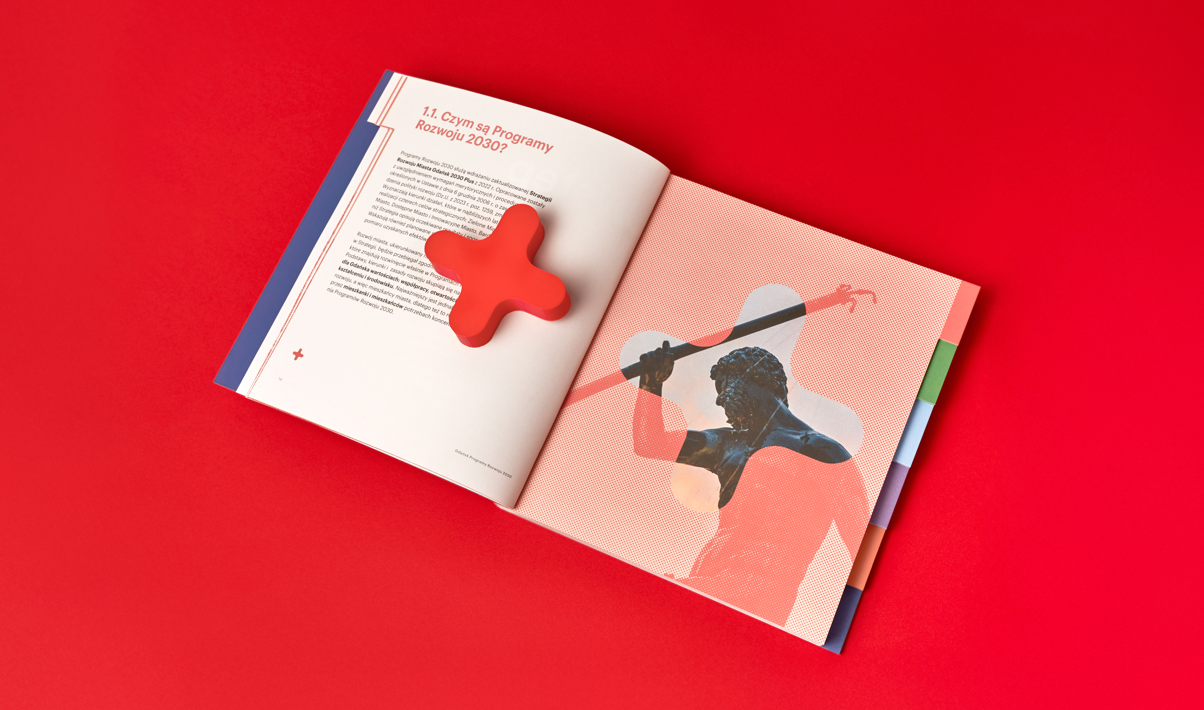
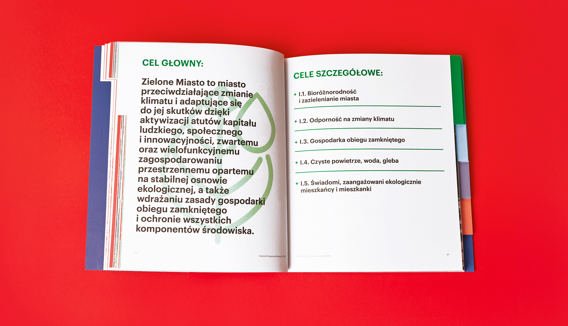
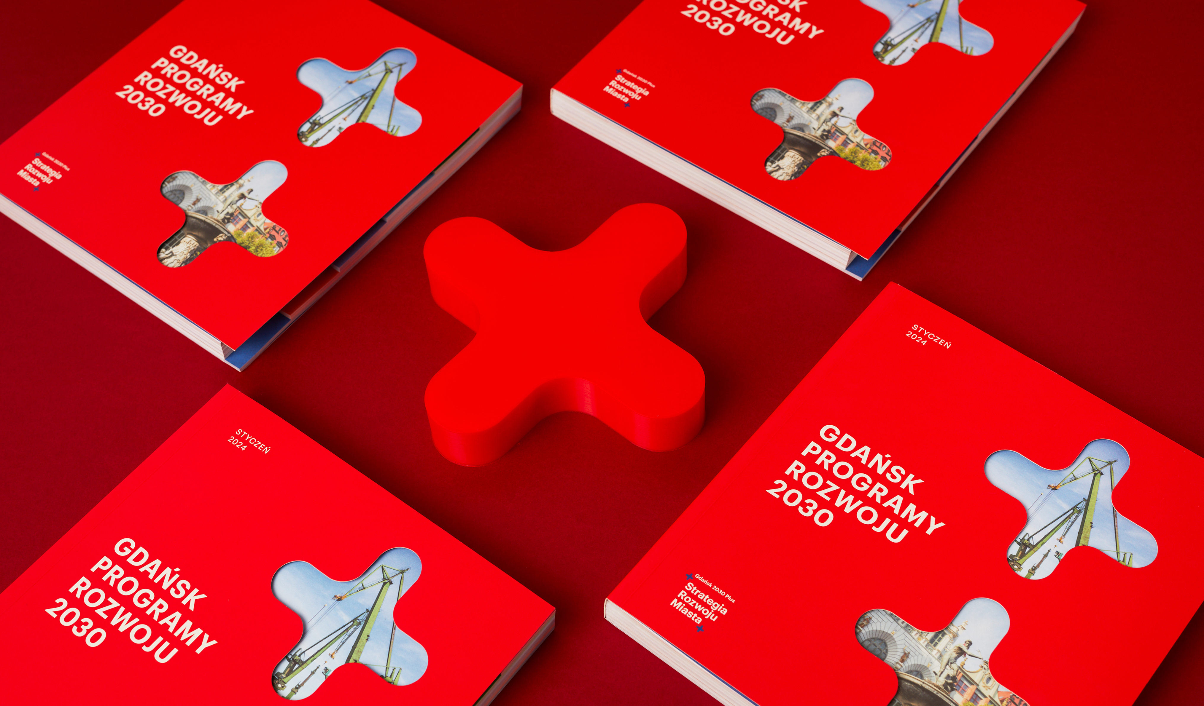
The central motif of the project is the plus/cross symbol – drawn from Gdańsk’s coat of arms and transformed into a modern graphic language. Pluses appear throughout the publication – as bullet points, navigational elements, decorations, and identifying marks. They create rhythm and character for the project.
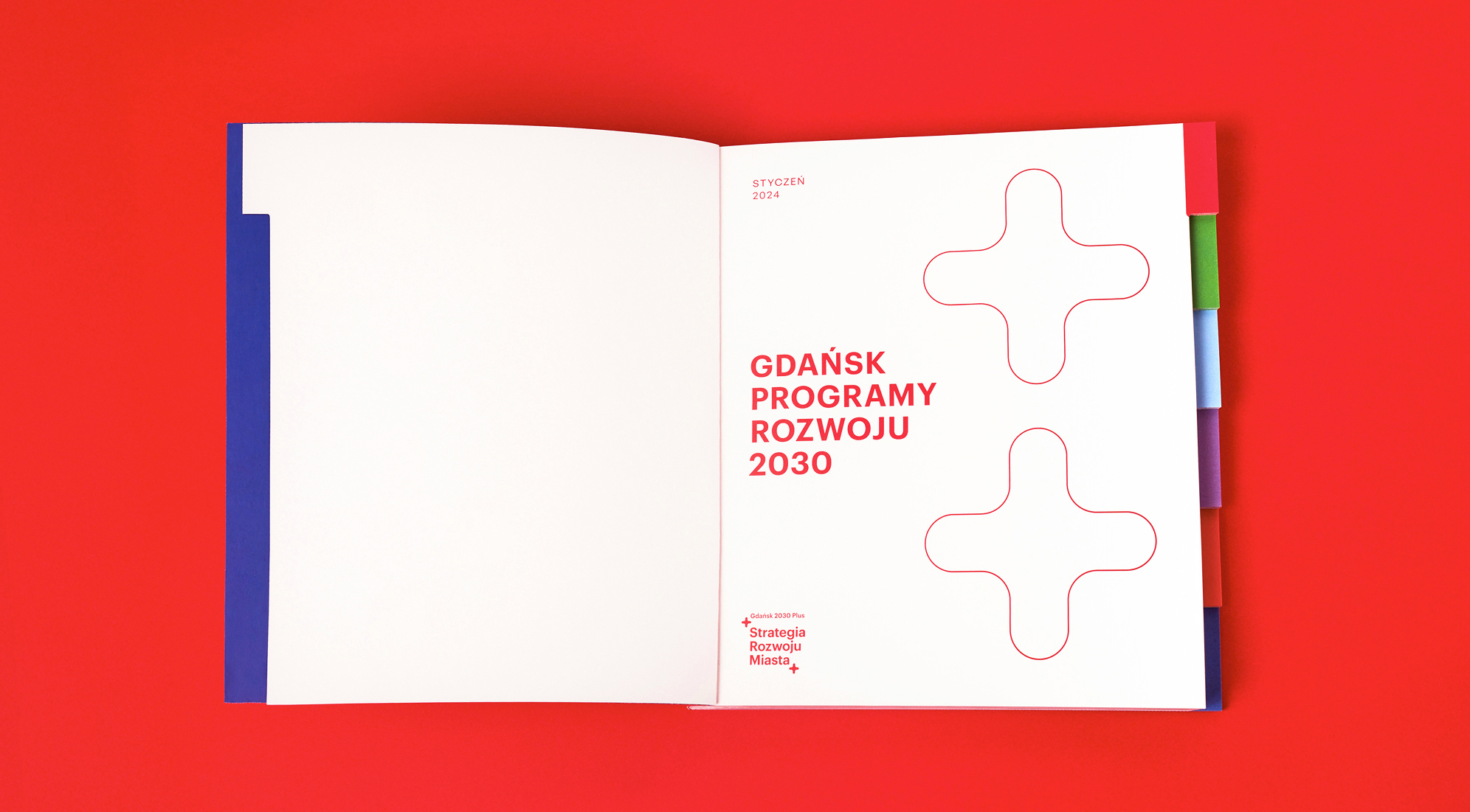
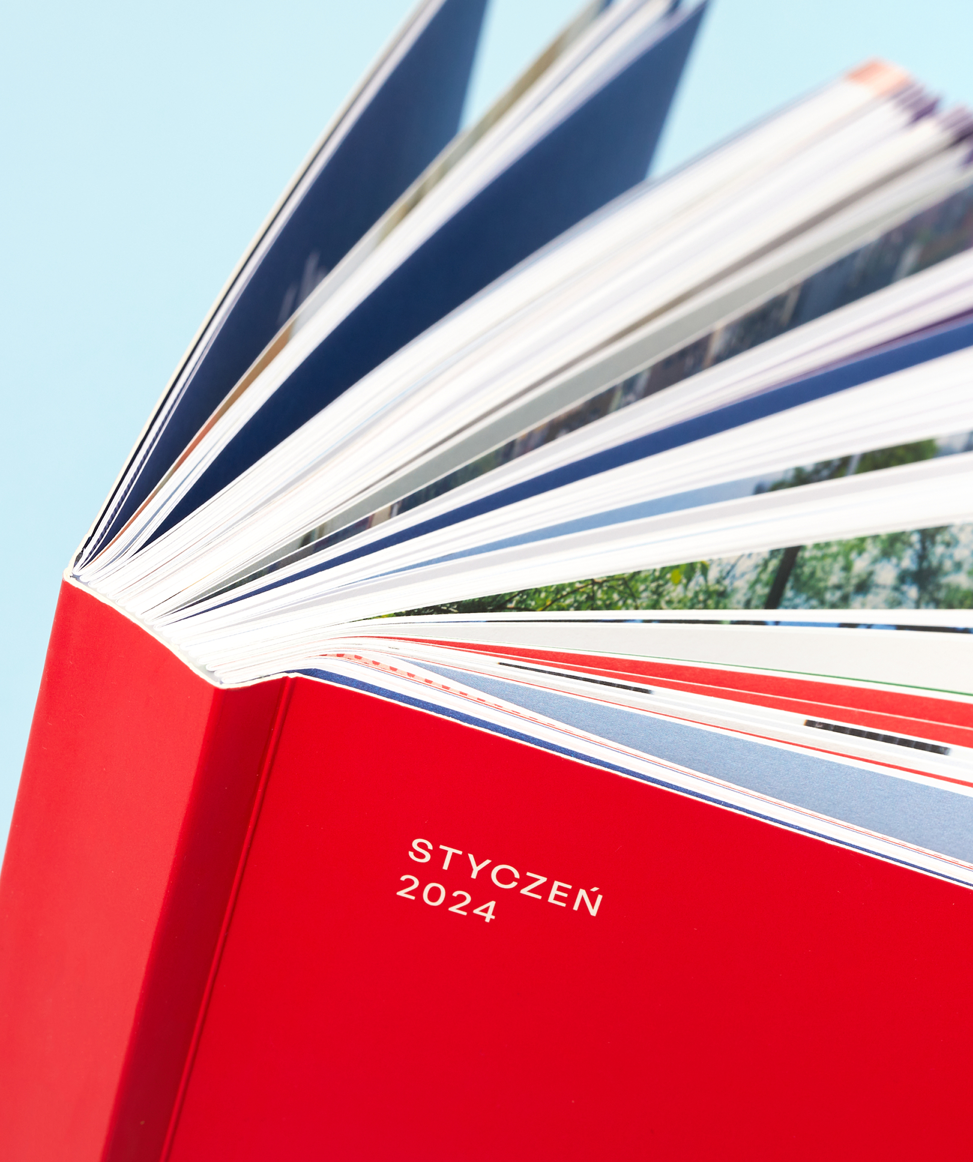
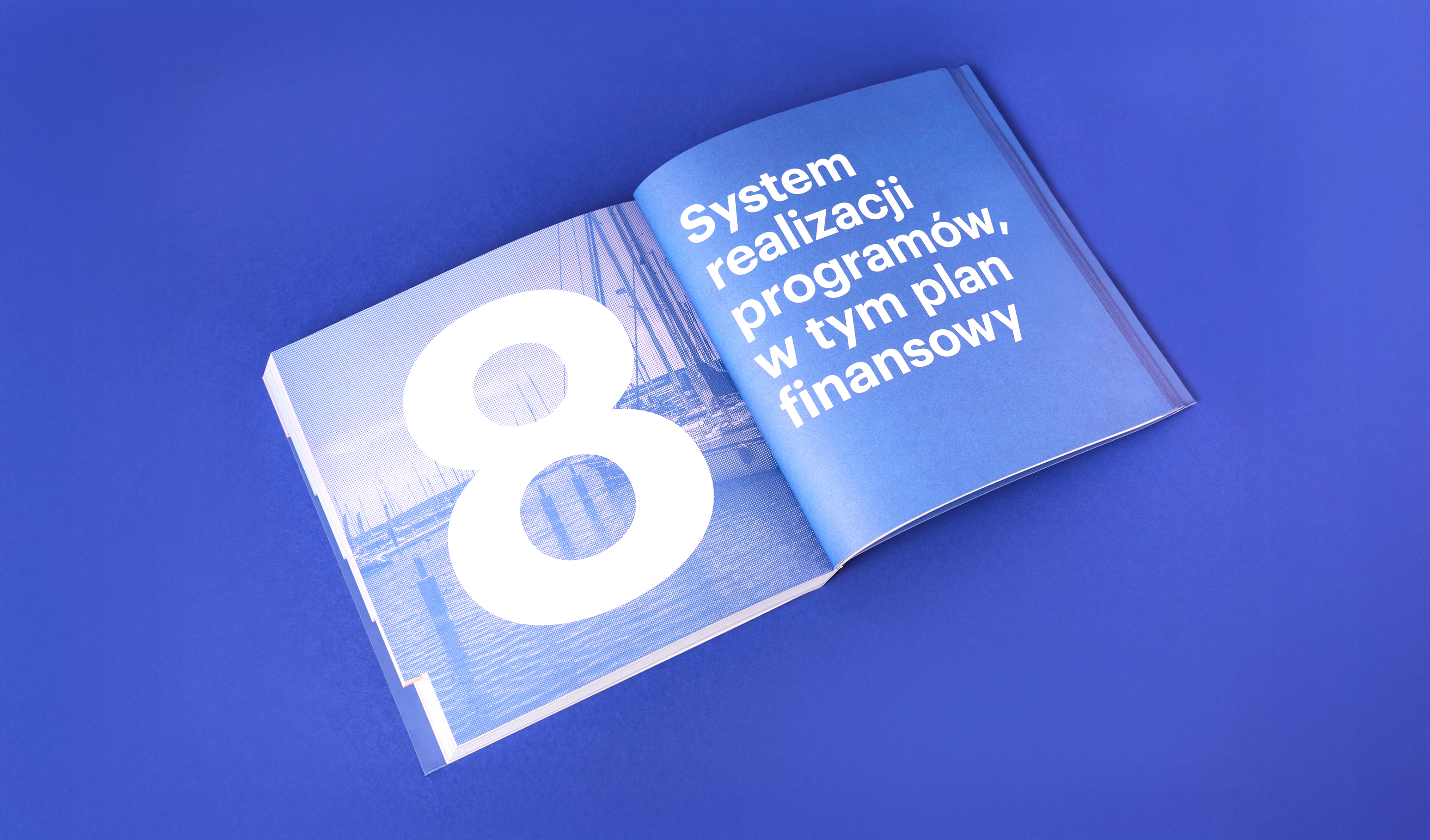
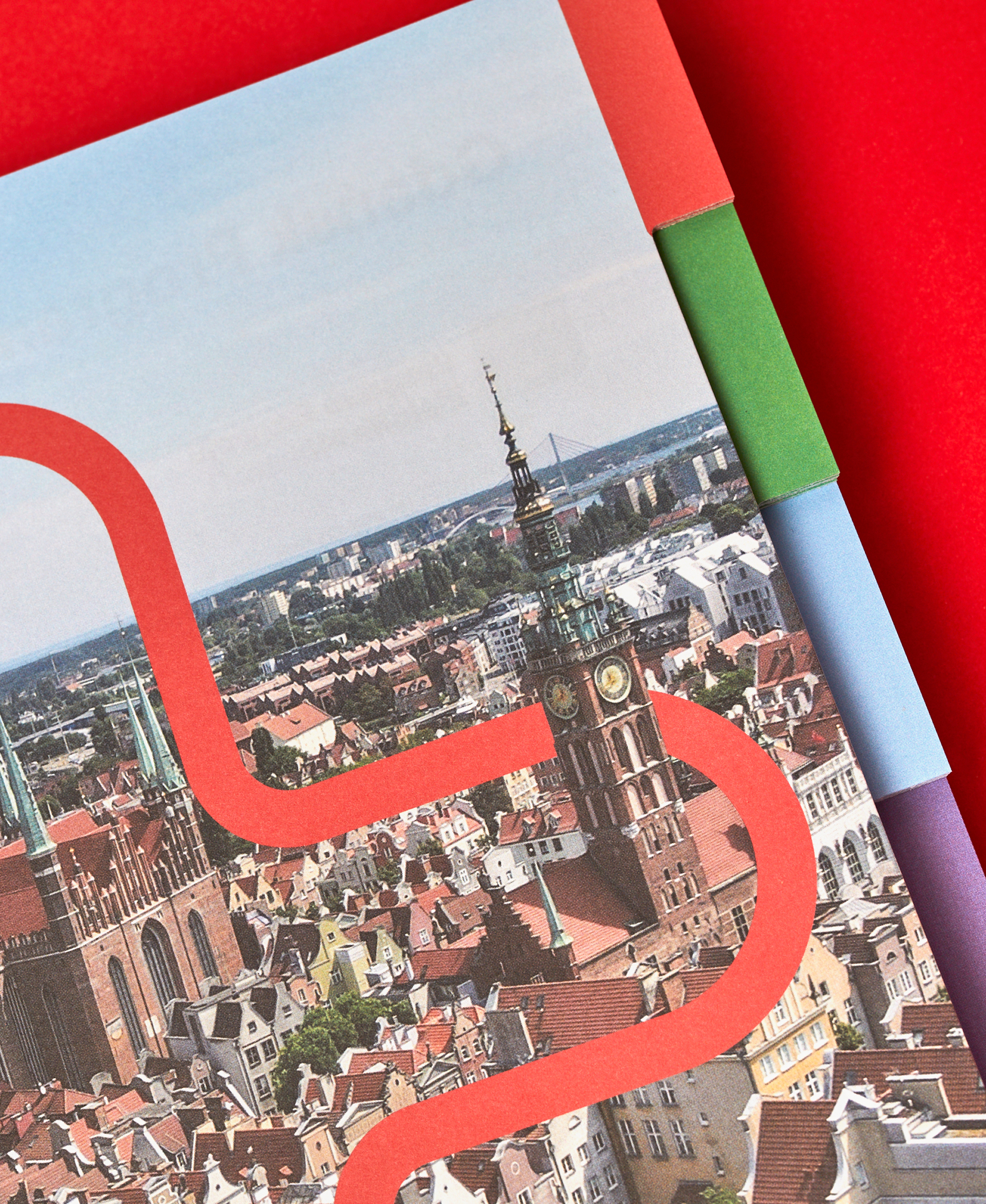
To make the content easier to navigate, each development area was assigned a different color. These colors influence the layout, typography, and graphics. They also appear as side registers that serve a navigational function. The entire publication is clear, accessible, and logically organized.
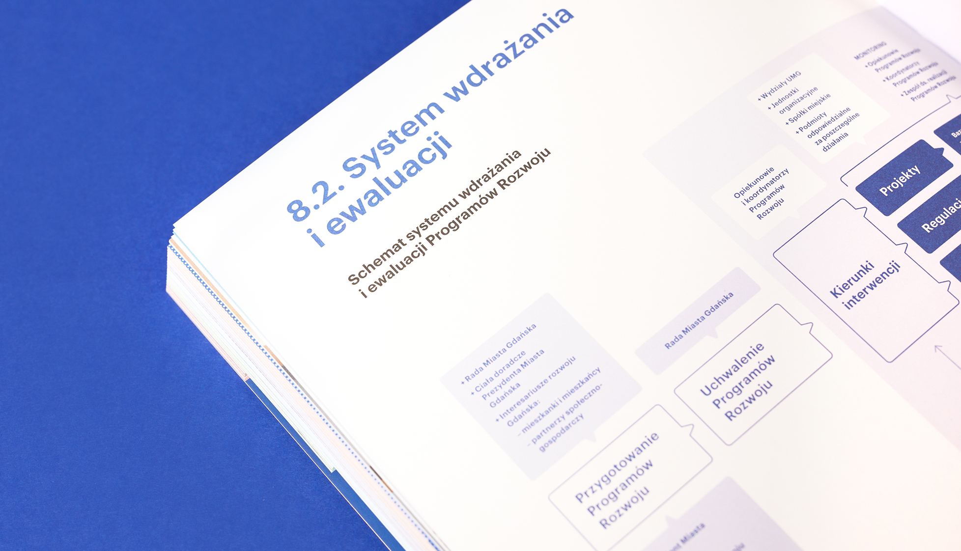
The graphic design is eye-catching and friendly to both internal and external audiences (residents).